Mar 25 2008
CC159 Simplify - Tutorial
I realize it is Spring, but I wanted to do the Color Challenge on Split Coast Stampers and these colors just remind me of Winter. If you would like to play along, here is the link: http://www.splitcoaststampers.com/forums/showthread.php?t=335287
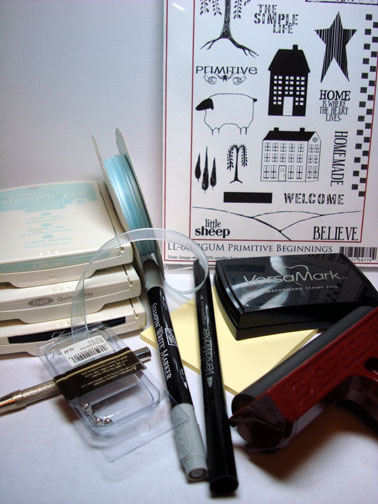
Supplies:
| Stamps: Cornish Heritage Farms Primitive Beginnings |
| Paper: Whisper White, Basic Black, Soft Sky |
| Ink: Stampin’ Up Basic Black, Going Gray & Soft Sky |
| Accessories: Versamark Pad and marker, Going Gray Marker, Post It Notes, Brads, Ribbon, Brayer, Sponges, Clear Embossing Powder, Heat Gun |
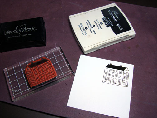
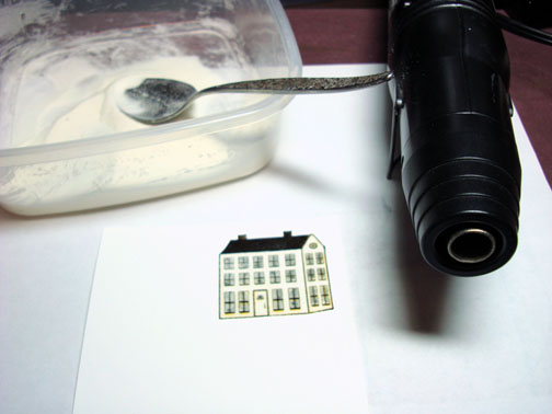
Stamped House on Whisper White card stock by first loading my stamp with Versamark and then Basic Black ink. Heat embossed image with clear embossing powder and heat gun.
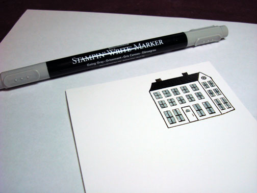
Colored the windows in with a Going Gray maker.
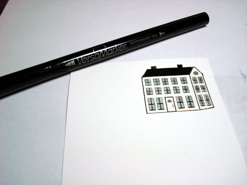
Went over entire house with a Versamark Marker and then heat embossed it with clear embossing powder and a heat gun.
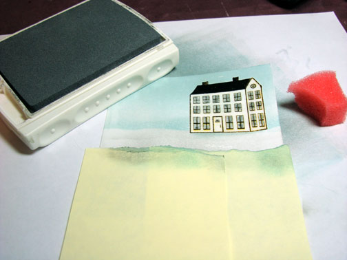
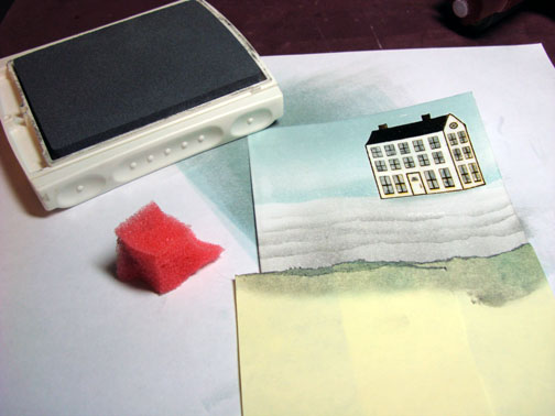
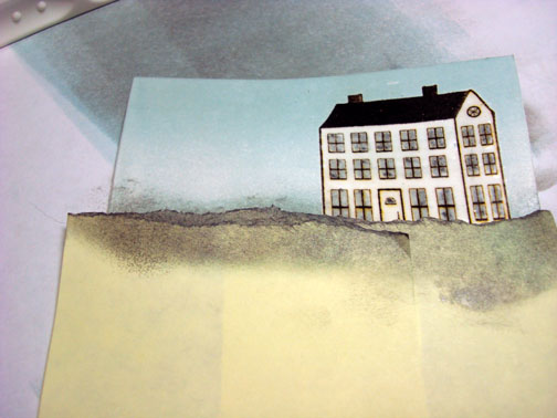
Brayered on Soft Sky ink for sky, keeping it darker at the top of the card stock.
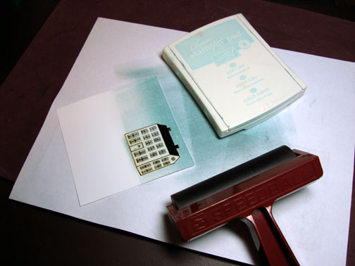
Brayered on Going Gray for ground, keeping it darker at the bottom of the card stock.
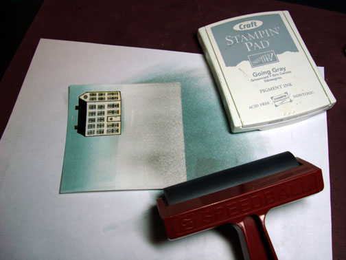
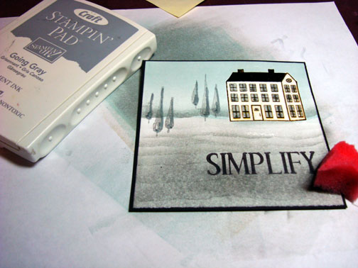
Tore two Post It notes to use as a mask. Note: I tore through the sticky part so some of it is remaining so it will stick to the card stock.
Sponged on Soft Sky Ink right at the torn edge of the Post It Notes.
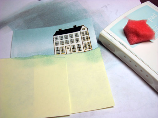
Moved the Post It Notes down a little on the card stock and sponged on Going Gray at the torn edge. I’m just putting a hint of color on at a time.
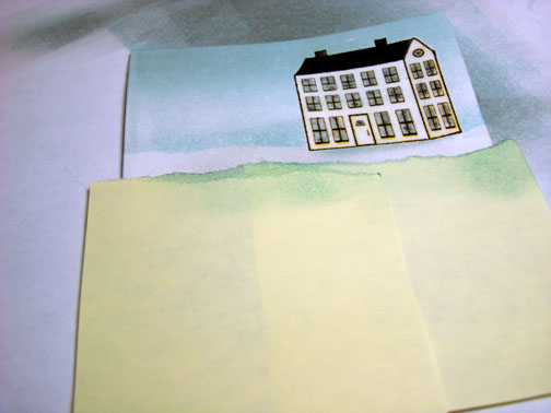
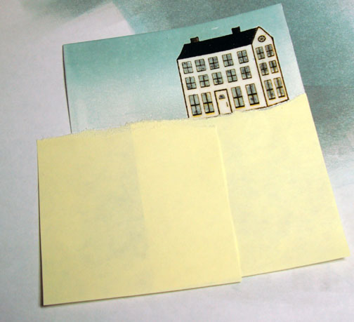
I continue to move the Post it note mask down a little at a time and sponge more Going Gray ink at the torn edge each time I move it.
Decided I wanted it darker up around the house so I moved my Post it note again to the horizon line and sponge on Going Gray ink at the torn edge.
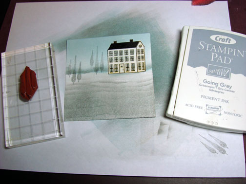
Stamped Trees with Going Gray ink.
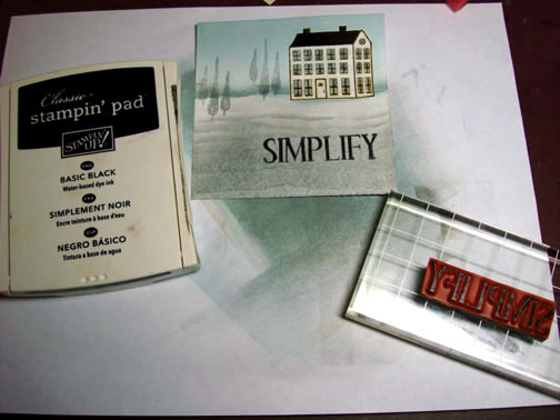
Stamped Sentiment with Basic Black ink.
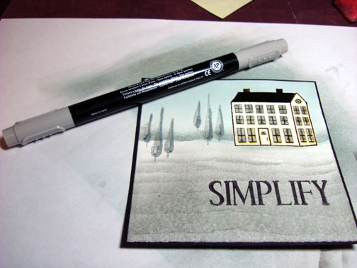
Added a shadow on the trees with a Going Gray Marker.
Created a bit of shadow under the sentiment by sponging Going Gray ink under it.
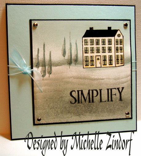
Assembled Card. Here it is finished.
I hope you enjoyed this tutorial and feel inspired to try out the color challenge.
Wishing you a day that is much warmer than this card appears. I think I will save this creation for next winter.
Until tomorrow. . . . . . .

Well, I have loved this set since I first saw it, but thought it would be too challenging to use all the elements together! But this is just a beautiful card, a real work of art! I love it! Thanks for your tutorial, it’s very helpful!
LeAnne
Love it. but your right , it does make us think cold. I am always amazed at how you can take anything and come up with the most beautiful cards. How do you do that and is there any hope for me.ha Thanks again for all your tutorials. Hope you had a blessed Easter.
Ks.stamper
Another fabulous card!! I just devour your wonderful tutorials. Not only can you create gorgeous art, but your teaching and photographic skills are amazing! Thank you!!!!
This is a beautiful soft, subtle card. You’ve used the colours very well! I was happily brayering yesterday but then got frustrated because I always get lines going across where the edge of the brayer rolls. How do you make your colours blend so nicely without the lines appearing that I get? I look at your tutorials carefully, but when I try it……lines!!! Any help would be much appreciated. Thanks.
Trish
Trish asked ” I always get lines going across where the edge of the brayer rolls. How do you make your colours blend so nicely without the lines appearing that I get?
Trish, I start my brayering at the very top of the cardstock, meaning most of the roller is off of the card stock and on my scrap paper and with each roll of the brayer I move a bit more down the cardstock. I ink the roller about 4 times for each color. I also, brayer, brayer and brayer some more to work the ink into the cardstock in between inkings. The more ink you get on the card stock the better they will blend together. Hope this helps.
Lovely shading and lovely primitive house stamp! LOVE IT!
Ok…I come to your blog almost daily to drool over your work…but I finally had to voice my words…well, at least type them…lol. I have to say I LOVE YOUR WORK!!! I aspire to be like you! Your work is BEYOND phenomenal!!! I can’t even think of just ONE word to describe your work! Bellisimo!!~Gabby
Thanks Michelle! I’ll try that.
Lovely card! Quick question: I notice that you often emboss your images by “coloring” them with a versamark pen. How quickly do you have to do this??? I mean, it seems that by the time I finished coloring the entire house the top part would be dry and I wouldn’t get a good embossed image. Thanks! Mary L.
Absolutely beautiful - love this set!
Mary asked “I notice that you often emboss your images by “coloring” them with a versamark pen. How quickly do you have to do this?”
Mary, the Versamark actually stays tacky for a while. I’ve never had problems with it drying before I put the embossing powder on. Great question!
Beautiful… Your tutorials are wonderful and I just love what you do… I tried my hand at the one with the wheat and added it to the samples at the stamp store that I work at… turned out not too bad but will have to practise more… Thanks so much!!!
Very cool, I have watched the John Adams story on HBO and when I saw this card I thought of that show right away.
Another breath taking card; I can not believe you are able to do so much with ink and stamps, you truly Inspire us all, as soon as my inks come in, I must try one of these.
thank you
Oh my, I have been noticing your cards for a while now, but just today came upon these tutorials. I am in awe, need to clean my space right away and try one of these!
You have an amazing talent, and I can’t wait to see what else you create!
I have to agree with you on the CHF stamps, too- they are so fab! And such a fun variety of images. And the free shipping over $35 isn’t bad, either!
Thanks for sharing!
Your Art work is so beautiful and inspiring. I have followed your tutorials and although my creations don’t compare you’ve inspired me to try.
Thanks!
Bev