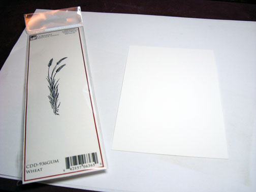
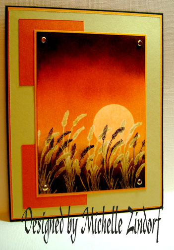
I have so many stamps that have not seen ink yet. This wheat stamp from Cornish Heritage Farms is one of them. Here is their wonderful website: https://www.cornishheritagefarms.com/intro.php?osCsid=dtmnia8l444rr6anm95hm03995 check it out.
Let’s get started.
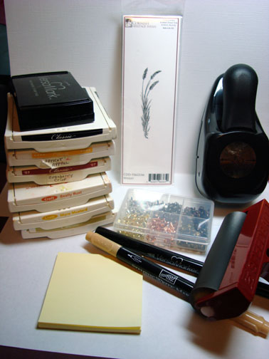
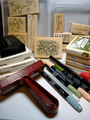
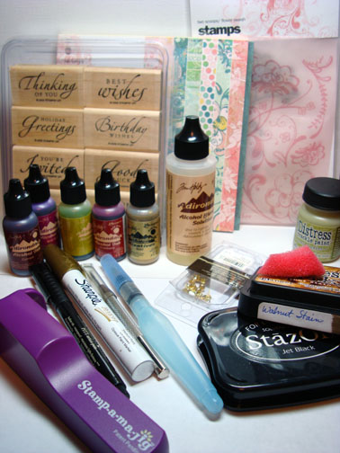
Supplies:
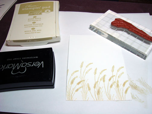
| Stamps: Cornish Heritage Farms Wheat |
| Paper: Stampin’ Up Whisper White, More Mustard, Really Rust, River Rock, Basic Black |
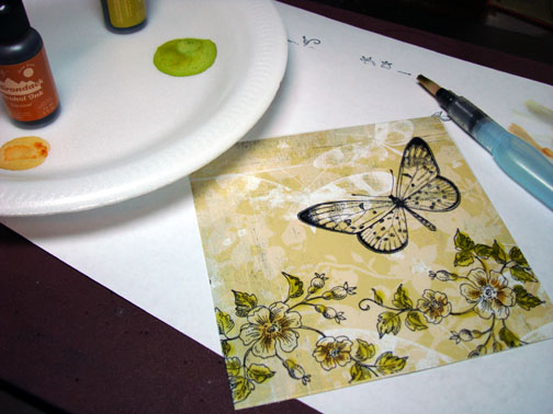
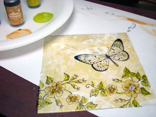
| Ink: Stampin’ Up River Rock, More Mustard, Pumpkin Pie, Really Rust, Cranberry Crisp, Apricot Appeal and Basic Black |
| Accessories: Versamark pad and marker, Brayer, Clear Embossing Powder, Heat Gun, Post It Note, Circle Punch, Brads |
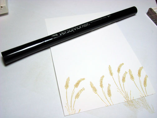
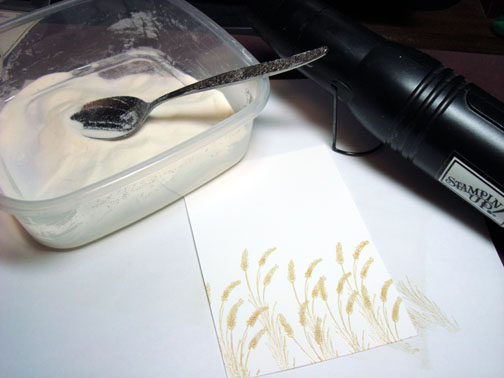
On Whisper White card stock, stamped first row of wheat, loading my stamp first with Versamark and then with River Rock ink. Heat embossed the images with Clear embossing powder and a heat gun.
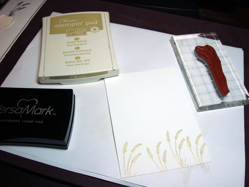
I wanted the wheat to stay light in color so I went over just the heads of the wheat with a Versamark Marker and then heat embossed them again with clear embossing powder and a heat gun.
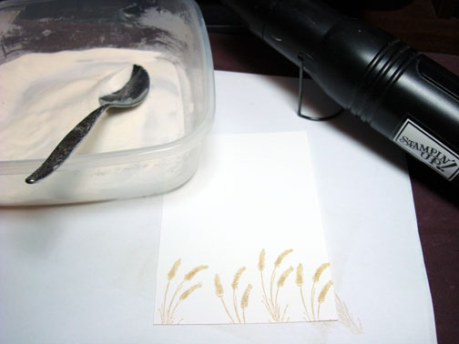
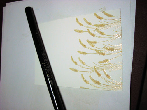
Stamped second row of wheat the same as the first, by loading my stamp with Versamark then with River Rock ink and heat embossing with clear embossing powder. Then going over the wheat with a Versamark marker and heat embossing again with clear embossing powder.
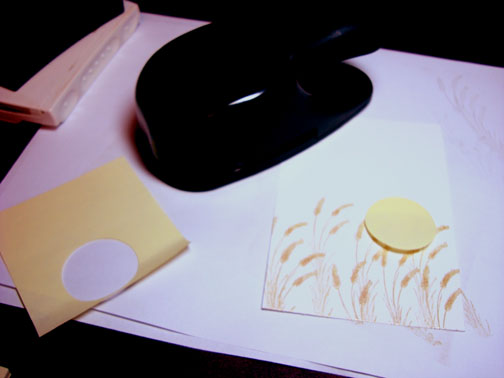
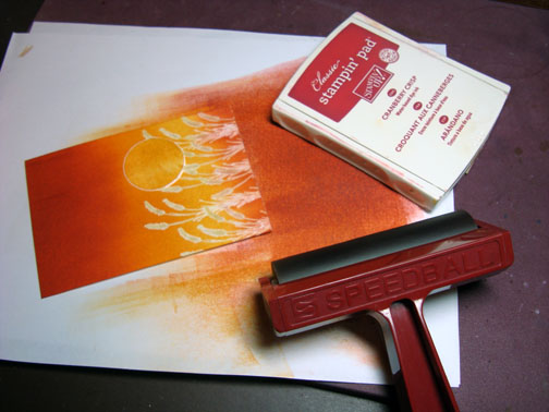
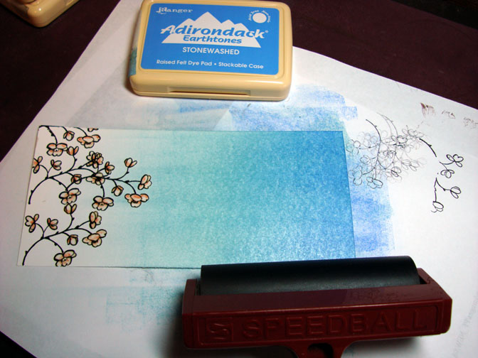
Punched a circle out of the sticky part of a Post It Note and used it as a mask for the sun.
Brayered More Mustard ink over the entire piece of card stock.
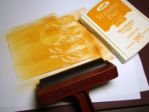
Brayered Pumpkin ink over top 1/3 of card stock. Then brayered Really Rust ink over top 1/2 of card stock.
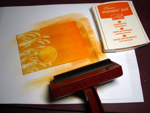
Brayered Cranberry Crisp ink over top 1/4 of card stock and a little at the bottom. We now have a graduation of color going on.
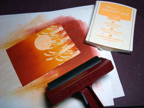
Removed Post It Note mask and brayered on Apricot Appeal to tone down the starkness of the sun.
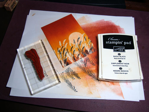
Stamped more wheat with Basic Black ink.
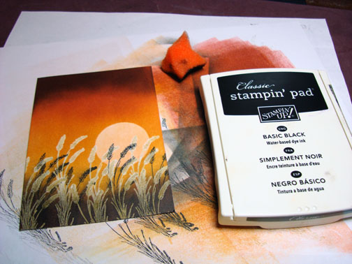
Sponged Basic Black ink at the bottom and top of the card stock. Used a clean part of the sponge to wipe the black ink off of the embossed images.
Assembled card.
Assembled card.
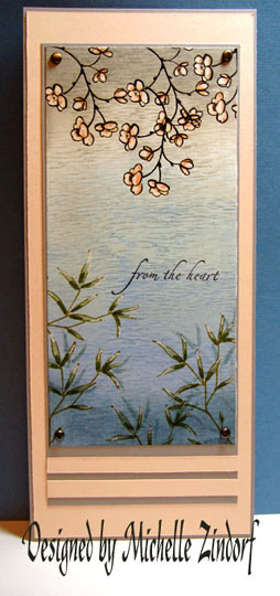
Glad you were able to join me for this tutorial.
Have a beautiful day!


