May 20 2008

Northern Lights - Tutorial

Published by zindorf at 4:25 am under Tutorials

dsc04037.jpg

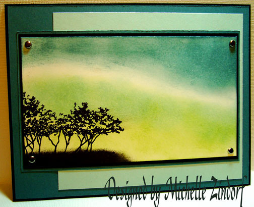
The Color Challenge on Split Coast Stampers was one that reminded me of Northern Lights, so I did a very quick card this morning and tried to create it.

If you would like to do the Color Challenge here is a link:  http://www.splitcoaststampers.com/forums/showthread.php?t=349309

Supplies:

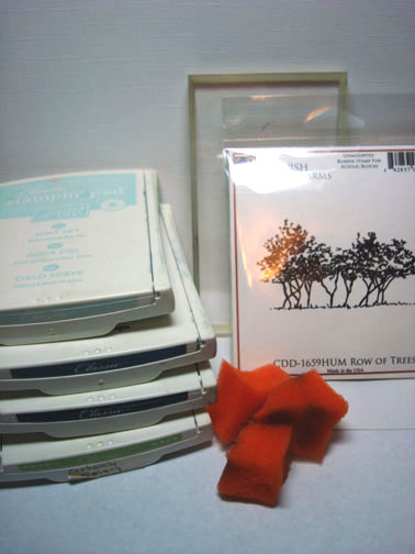
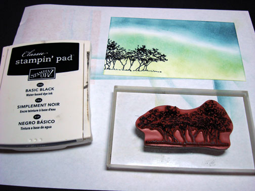
Stamps: Cornish Hertiage Farms-Row of Trees
Paper: Stampin’ Up Whisper White, Basic Black, Soft Sky, Blue Bayou
Ink: Stampin’ Up Soft Sky, Blue Bayou, Basic Black & Certainly Celery
Accessories: Brads, Sponges

dsc04038.JPG

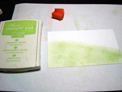
Sponged Certainly Celery ink on Whisper White card stock.

dsc04030.JPG

Sponged Blue Bayou ink at the top of the card stock leaving a white showing between the it and the Certainly Celery ink.

dsc04031.JPG

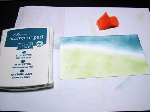
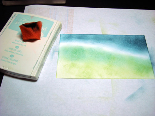
Sponged Soft Sky Ink over the top part of the Certainly Celery ink.

dsc04032.JPG

Stamped trees with Basic Black ink.

dsc04033.JPG

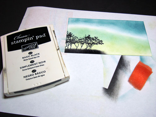
Sponged Basic Black ink at the base of the trees.

dsc04034.JPG

Assembled card and here it is finished measuring 5″ x 6.5″.

dsc04037.jpg

Hope your day is filled with beautiful skies.

Until my next post. . . . .

Michelle

24 Responses to “Northern Lights - Tutorial”

  1. yvonne w.on 20 May 2008 at 4:32 am

    What a beautiful card. This one I’m trying for sure:) What you do with a little ink and paper is beyond me!!!

  2. Karen D.on 20 May 2008 at 4:38 am

    Absolutely breathtaking!

  3. Shellyon 20 May 2008 at 4:42 am

    Man this is pretty Michelle! I love today’s colors and haven’t gotten to put ink to paper yet. (did they remind you of another combination?)

  4. Nicole Steeleon 20 May 2008 at 4:46 am

    You are amazing! I have two questions for you: Do you keep your Basic Black ink pad very well-inked? (Your black stamped images always look so rich and dark). And do you have to refill/reink and replace your nib tips on your Prismacolor markers often? (I assume they are solvent ink-based). Ok, I lied, three questions LOL…What made you choose Prismacolor over the ubiquitous Copics?

  5. zindorfon 20 May 2008 at 4:52 am

    Nicole asked “Do you keep your Basic Black ink pad very well-inked? (Your black stamped images always look so rich and dark). ”

    Nicole, I just replaced my black pad so it is brand new. :)

    Nicole asked “do you have to refill/reink and replace your nib tips on your Prismacolor markers often?”

    Nicole, My markers are also brand new so I’ve not yet had to replace anything on them.

    Nicole asked “What made you choose Prismacolor over the ubiquitous Copics?”

    Nicole,
    I’m definitely not the expert on markers and never have used Copic. I did the research on the whole Copic verses Prismacolor markers and found there was not enough difference in the products for me to pay the price for the Copics. I only use them for card making so the Copics at $5 a piece is a bit steep for me. I purchased one of every color of the Prismacolor markers from Ebay and paid $249.00. So far I am very happy with them.
    You might want to check out the Prismacolor website. They have videos showing artist using the different products. There is a nice video of an artist using the Prismacolor markers so you will be able to see how nicely they lay down on the paper.
    Well there is my two cents on markers, lol.

  6. Debieon 20 May 2008 at 5:21 am

    Beautiful card Michelle! Thank you also for addressing the Prismacolor vs. Copic question. I have been struggling with the decision of which to buy. I bought a few loose Copics and like them but they are expensive.

  7. Kathyon 20 May 2008 at 5:22 am

    Look at that dazzling sky! This is sooooo beautiful!!!

  8. Gidget-Trishon 20 May 2008 at 5:24 am

    This scene is so serene and beautiful. Your work is always such an inspiration. Thanks again.
    Trish :)

  9. Dawnon 20 May 2008 at 5:43 am

    another fab card sweetie!

  10. Evelynn----Ks.stamperon 20 May 2008 at 6:24 am

    Michelle you are truely one of a kind. You put color down so beautiful. I put color down and I promise you it does not look like this. Help!!!!!!.haha
    Evelynn

  11. Jackie W.on 20 May 2008 at 6:37 am

    Oohh! I love this one! The colors rock and then the dark trees - terrific!

  12. Tonnieceon 20 May 2008 at 7:56 am

    What a wonderful scene. I just love this one
    You never fail to amaze me.

  13. Conniecrafteron 20 May 2008 at 8:26 am

    Beautiful work on the sky, Love it!

  14. MSBetsyZon 20 May 2008 at 9:48 am

    Another wonderful card, Michelle! I’ve only witnessed the northern lights once, but this really evokes the look of them! Great job! Glad you’re feeling better…

    Hugs,
    Betsy

  15. ROBINon 20 May 2008 at 10:22 am

    I love this one, I have been looking at more and more of stamps in such different ways because of you. Thank you for the great ideas and keep them up and coming.

    I can not wait to get home and try this one out.

  16. HBon 20 May 2008 at 7:18 pm

    WOW! WOW WOW WOW!!!!!!!!
    I am speechless.

  17. Rebekkaon 20 May 2008 at 10:14 pm

    what a beautiful card, every thing you do seems like a painting. thank you for sharing
    Becky

  18. Doneldaon 20 May 2008 at 10:37 pm

    Michelle, this is so pretty!! I love how your creative brain works - truely amazing.

  19. Melanie Muenchingeron 21 May 2008 at 6:16 am

    WOW!!!

  20. Karenon 21 May 2008 at 3:02 pm

    Classic Zindorf!
    What a beautiful card. I LOVE this one. So peaceful.
    Thanks for sharing your tutorials with us!

  21. Linda Marieon 21 May 2008 at 4:44 pm

    WOW! Jaw-dropping lovely!

  22. Heather Fullertonon 22 May 2008 at 4:45 am

    I have run out of original comments to make on your fantastic artistry. Michelle you are by far the most talented card/paper artist on the web. The way you share your talent and the ease of your tutuorials make you a Star Class Leader of the Learners of this craft. Wow oh Wow…you are my hero and my teacher. Thanks for always sharing.
    Retired Heather

  23. Ann C.on 22 May 2008 at 8:00 am

    Very pretty color choice - love the blue and green with the black image. An additional note about Prismacolors: they are the marker of choice in the fashion design department at many universities.

  24. Bev Ochabon 30 May 2008 at 6:40 pm

    Another stunning card!!!! I have used your tutorials to make alot of my cards.
    When someone comments about the beauty of the card I always say Michelle
    Zindorf designed it and I copied her work (my friends and family wouldn’t know what cased means)…As time has gone on I answer the comments with “It’s a Zindorf”
    The other day I was a hurry and sent one of my BZ (before Zindorf) cards.
    My SIL called to thank me for the “nice” card. She said “But, It’s not a Zindorf”
    Thanks Michelle!!!!

Trackback URI | Comments RSS

Leave a Reply