
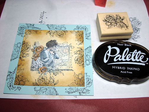
It’s FRIDAY!!! On Fridays Split Coast Stampers.com has the limited supply challenge. Today’s challenge is to use the supplies you have not used in quite a while, you know the ones that have all the dust on them, lol. Well I went way back and dug this Stampin’ Up set “See with the Heart” out. It’s a beautiful set that dates back to 2004 and has only seen ink once since I got it. I also used my poor neglected Prismacolor pencils and Odorless Paint Thinner today. This card is not my usual style, but that is why I like the challenges. They make you stretch and when you stretch you grow. 🙂
FYI, my brayer workshops at Marco Paper in Dayton, OH on September 6th have sold out so we have add a Brayer workshop on September 13th. So if you missed out on the 6th sign up for the 13th of September and we will take the mystery out of using that brayer. To register, please contact Marco Paper at 937-433-7030 or 1-888-433-5239 or website at https://marcopaper.com/index.html
Let’s get going on the tutorial. 🙂
Supplies:
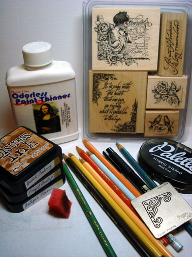
| Stamps: Stampin’ Up Seeing With the Heart |
| Paper: Stampin’ Up Whisper White, Soft Sky & Basic Black |
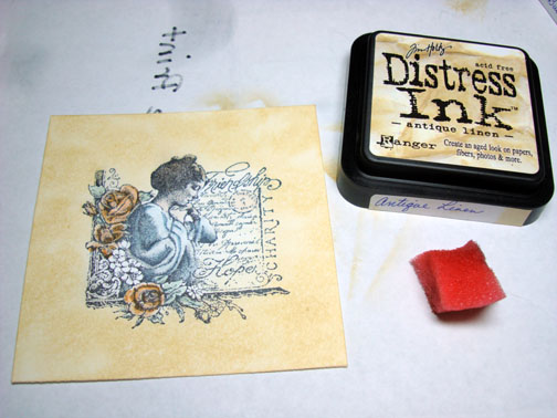
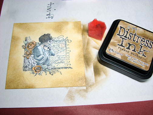
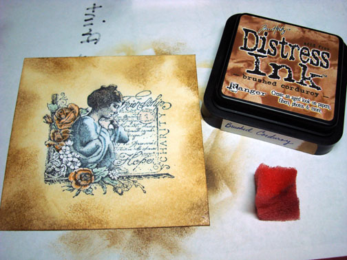
| Ink: Palette Noir Black, Distress inks Brushed Corduroy, Frayed Burlap & Antique Linen |
| Accessories: Prismacolor Pencils & Odorless Paint Thinner, Sponge, Cuttlebug Corner die, Faber Castell Fine Point Black Marker, Brads |
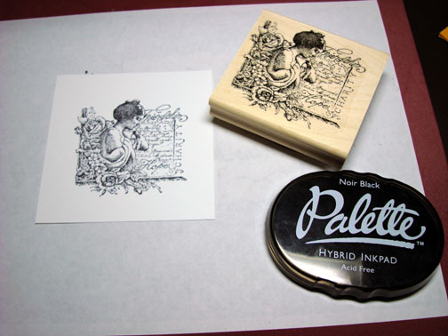
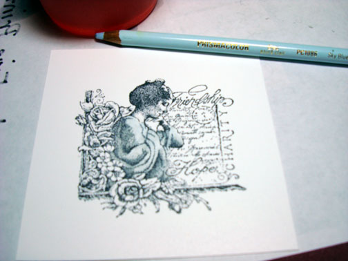
I started out by stamping the main image on a 4.5″ x 4.5″ piece of Whisper White card stock with Palette Noir Black ink. I used this ink because I will be coloring with a solvent based medium and this ink won’t smear with this technique.
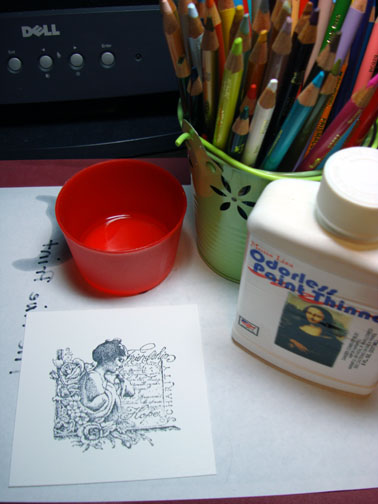
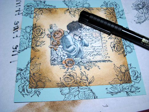
I say the coloring medium is solvent based because I dip the tip of my Prismacolor Pencil in Odorless paint Thinner before coloring so the color melts on the paper like butter and you can blend so well with this method. I don’t use blending stumps, I just start with my lightest color and blend with the pencils as I go.
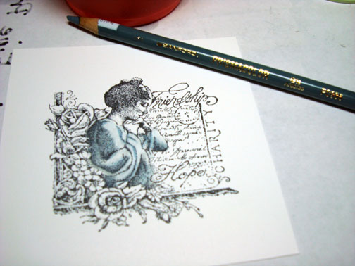
I picked a light blue (Sky Blue Light) and a Darker Blue (Slate Grey) to color her dress. I colored her dress in completely with the Sky Blue Light an then colored the dark areas of her dress with Slate Grey.
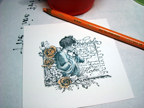
For the Roses I pick a light Peach (Peach) and a dark Peach (Pumpkin Orange). I colored the roses in with Peach and then the darker areas of the roses with Pumpkin Orange.
Colored her skin with Light Peach.
Note: I left the small flowers uncolored so the white would draw the eye into the image by being such a contrast to the colored image.
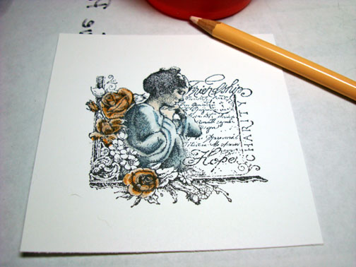
Colored the leaves with Celadon Green.
Colored her hair with Dark Brown.
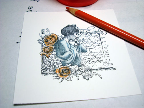
Colored the background area to the right of her with Cream.
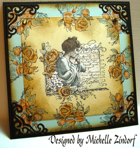
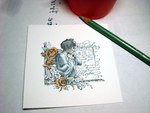
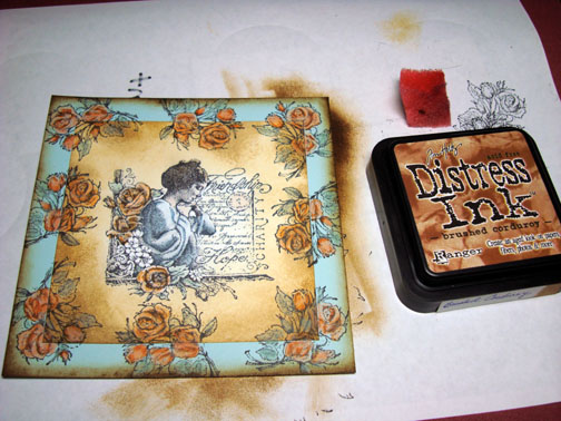
Sponge Distress ink Antique Linen around the edge of the card stock, up to the image.
Randomly sponged Distress ink Frayed Burlap around the edge.
Got a bit darker by randomly sponging Distress ink Brushed Corduroy on the edge of the card stock.
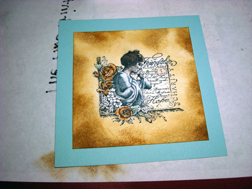
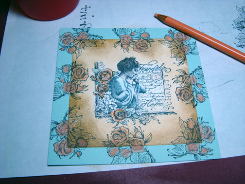
Adhered the main image panel to a 5″ x 5″ panel of Soft Sky card stock.
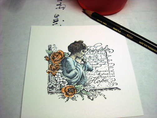
Stamped the rose image around the edge of the card-stock. Note: when you stamp over multiple layers of card stock you will have gaps in your design where the card stocks meet.
Filled in the gaps with a Faber Castell Fine Point Black marker. This marker is made of Indian ink and and works well (doesn’t smear) with solvent based coloring mediums.
Colored the Roses the exact same way I did on the main image panel by using the same colors.
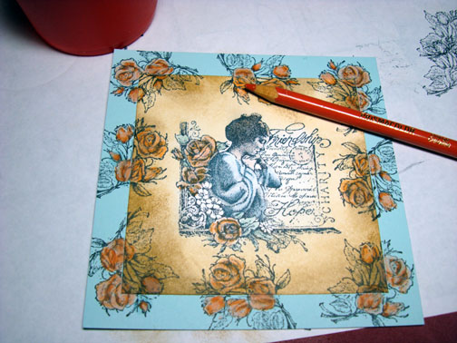
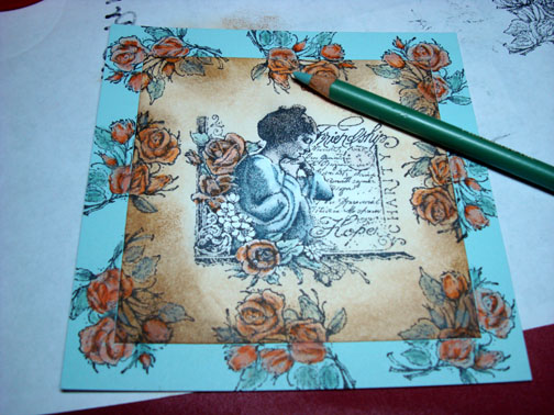
Sponged Distress ink Brushed Corduroy right on the edge of the Soft Sky panel.
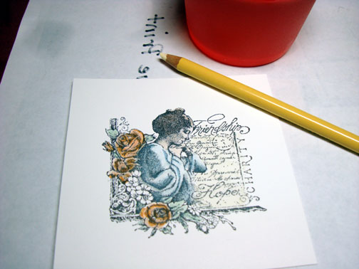
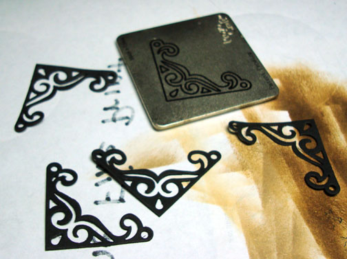
Cut out 4 corner pieces using my Cuttlebug.
Assembled card, added brads and here it is finished measuring 5.25″ x 5.25″.
I hope you enjoyed this coloring tutorial and will be inspired to get out those stamps you have been hording and not using. They are just longing to see they light!
May your day be filled with the smell of a Victorian garden.
Until my next post. . . . . . . .. . . . . .
Hugs,
Michelle
42 responses to “Prismacolor Pencil Victorian – Tutorial #107”