Mar 25 2009
Wild Direct to Paper Sky - Tutorial #191
Okay, I know this is my second tutorial today, but it has been raining all day and I am procrastinating. I should be out doing my grocery shopping. Instead I am hanging out in my PJ’s stamping away.
This is a very easy sky to create with Tim Holtz Distress ink pads. I used just the corner edge of the pad and smeared in different colors. I think I like the effect of this. I bet it would look great with pastels too.
Let’s get started.
Supplies:
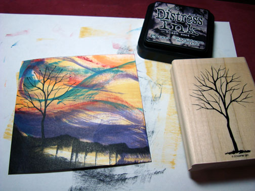
| Stamps: Stampin’ Up Branch Out |
| Paper: Stampin’ Up Whisper White & Basic Black |
| Ink: Tim Holtz Distress inks Aged Mahogany, Faded Jeans, Dried Marigold, Dusty Concord, Black Soot & Scattered Straw |
| Accessories: Gray marker, White Gel Pen, Post it Note |
Please don’t forget you can order your Stampin’ Up products from me 24-7 from this link: http://michellezindorf.stampinup.net or e-mail me at mzindorf@aim.com if you are within the United States. Also, please consider being part of my Stampin’ Up Team. We have valuable monthly meetings in Miamisburg, Ohio.
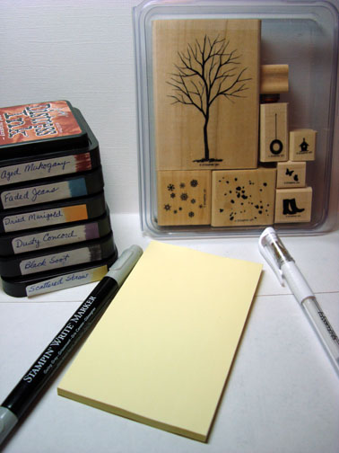
I started out with a 4.5″ Square piece of Whisper White card stock and smeared the Scatter Straw distress ink directly on the card stock using the raised edge of the ink pad.
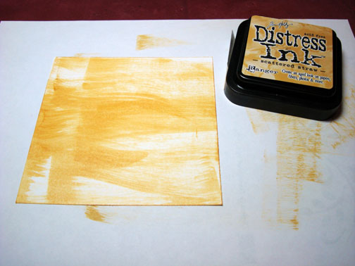
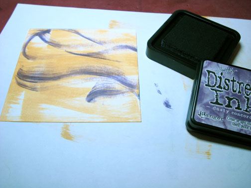
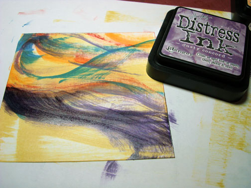
Smeared on a little Dusty Concord distress ink using only the corner of the raised pad.
Smeared on Aged Mahogany Distress ink using only the corner of the raised pad.
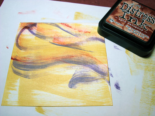
Smeared on a bit of Faded Jeans Distress ink only using the corner of the raised pad.
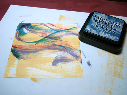
Add a touch of Dried Marigold Distress ink using the only the corner of the raised pad.
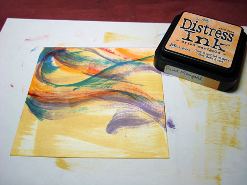
Smeared on more of the Dusty Concord Distress ink at the bottom of the card stock.
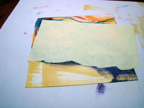
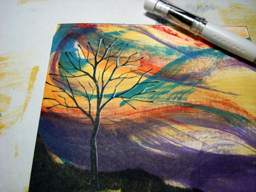
Tore through the stick part of a post it note and used it as a mask at an angle to create my ground area.
Using the edge of a Black Soot Distress ink pad I smeared the ink on the bottom of the card stock, pulling the pad straight down. This created those streaky lines.
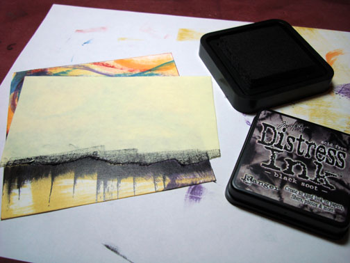
Removed the post it note and added some more Black Soot ink at the bottom of the card stock. I liked the streaky look of the the black ink so I did not cover it all up. I think it adds some interest to the piece.
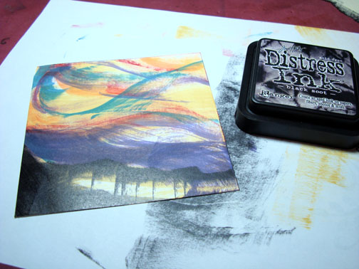
Stamped the tree using Black Soot Distress ink.
Added White Gel pen highlights to the right side of the tree.
Assembled card and added a Gray marker outline to the left and bottom sides of the small black card stock panel to add a casted shadow. I also added a few white gel pen dots to the ground area.
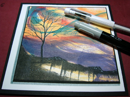
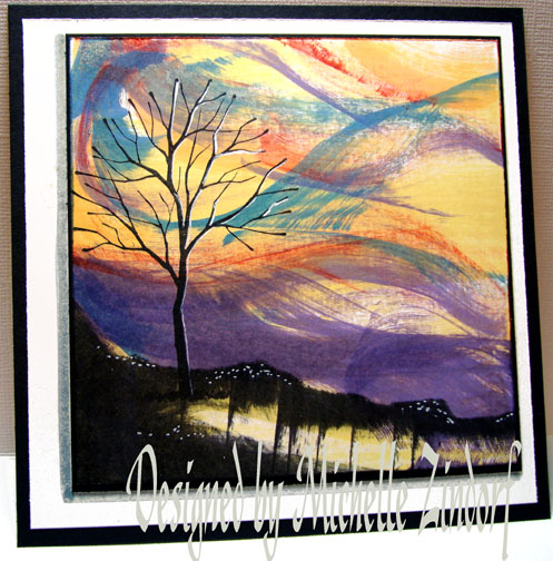
Here is the finished card measuring 5.5″ square.
I hope this has inspired you to smear some ink around today.
Until my next post. . . . . . . . . . . . .
Hugs,
Michelle
Get ready for Brayer Workshops! I am coming to:
Fort Smith, Arkansas
Dayton, Ohio
Savannah, Georgia
Covington, Indiana
Buffalo, Minnesota
Webster, New York
New Johnsonville, Tennessee
Stoughton, Wisconsin
Castro Valley, California
Yardley, Pennsylvania (near Philadelphia)
Knox, Maine
Broomfield, Colorado
Lynchburg, Virginia
Columbia, Missouri
Here is a link to my workshop calendar where you can see all of my travel schedule and to get info on beginner and advanced Brayer workshops: http://zindorf.blogs.splitcoaststampers.com/workshop-calendar
Link to my Stampin’ Up website were you can order all of your must have Stampin’ Up products from me 24-7: http://michellezindorf.stampinup.net
Here is a link to all of my tutorials: http://zindorf.blogs.splitcoaststampers.com/tutorials-ive-written/
Frequently asked questions answers: http://zindorf.blogs.splitcoaststampers.com/frequently-asked-questions/
This card is so awesome! Reminds me of the wind and the bare trees, which is what March looks like in Nebraska. I’ve got to try this! Thanks so much for sharing your talent!
that card is really gorgeous! i’ve had my eye on that stamp set for a while too.
Michelle, I’m just loving this card!! Beautiful. I love that it is so different from the other ones I’ve seen. You’re so talented!
I just LOVE this image that you created! It is awesome. Great work!
Trish
WOW! I think only God could make a prettier sunset (that’s what it looks like to me)…maybe a sunrise. This is great! Thanks for the second tutorial. It makes us happy!
WOW! This is brilliant! I’d stay in my p.j.’s and have more fun if I were you!!
I LOVE this card.
you’re so very lucky to have such an eye for colour…you’re very talented…
Wow!!!!
Thunk! Did you hear my jaw drop on the floor?!! This is so stunning! And to think I ordered a boatload of Distress inks this week! Yes!! I only hope I can do you justice.
You are such a source of inspiration for me…. I’ll try to share what I come up with!
Oh fab 2 such different cards in 1 day! You’re spoiling us (oh please don’t stop!)
Holy Cow! This looks like something you’d see in a museum. I’m definitely going to try this, although honestly, I’m afraid it’s going to end up looking like something I dropped on the floor! Thanks for the inspiration!
Ummm…..WOW!
i LOVE this, it’s dynamic in and its moving… i love it.
thanks for showing.
johanna
Beautiful card! The bright colors like an aquarelle look, fantastic and inspriring.
Have a nice day,
hugs from germany, Anja
Every morning driving to work (at 6:45 am!), heading east, I get to absorb the beautiful sunrises in the sky, and it looks just like your card. Thank you for the inspiration to use my Tim Holtz Distress pads, purchased awhile ago, and have not used yet. Now I know what to do with them!
You’ve done it again - I’m speechless!
WOW!!! great card Michelle.
I love this one. The distress inks are my favorites and this technique is awesome!
Great card and love the technique for those of us who still can’t use a brayer.
Lisa
Holey Moley!! We get a Twofer today!!! Wish we were getting some of the rain our way. I really like this direct to paper technique. I do have challenges when deciding what colors to use. Glad I can use your tutorials for references. Beautiful scene.
Fantastic - I can almost hear the wind in the branches of that tree! I must have a go at this… although like Marlene my efforts will probably end up on the floor too!
Incredible! This reminds me of wild weather, also. Thanks for the inspiration!
Just beautiful as always! You should really foward this on to Tim Holtz! I bet he would love it too! Thanks as always for sharing with the rest of the world!
Michelle this card is totally AWESOME! It is artistic, creative and colorful - with a little funky thrown in for a contemporary touch.
As always, thank you for sharing your creativity and your inspiring tutorials.
-m
WOW….When I opened up my email and saw that card, I was blown away. Now if I started to swipe ink pads, it would look like a mess! But when you do it, it’s a masterpiece! You are so inspirational!!! I know what you mean about being raining and gloomy and stay in your pj’s type of day. Today is definitely that type of day!
HUGS
Michelle, this is awesome. I don’t know why but I think of the Wizard of Oz in this picture. The way you pull colors together is amazing. I think you have to be born with that gene!
Wow! Is that how all your commenters respond to all of your great projects? Well, I think its my initial response, every time! I just love this!! I do not think I’ve seen direct to paper quite like this before! :>
This is fantastic! Love the colors… perfect for a Halloweenie occasion!
Michelle!! Kool background!!! Looks really windy!
Take care and STAY POSITIVE!
WOW
I enjoy your daily tutorials, but this one particularly blows me away! That sky is magnificent!
Michelle I’m blown away!!! That is so totally awesome!! good thing I didn’t see it before I went to work or I’da played hookey!
Thanks so much for your tutorial!!!
beautiful as always!!
I love the colors at the top of the card but the bottom looks angry!
Michelle, you are a girl after my own heart. I wish I could have stayed in my PJ’s to stamp today! It is amazing at the things you come up with for cards! See you in Ohio for the workshop next week!
Reminds me of a Northern Lights sky… great job
Oh my. This is an absolutely stunning card! Thanks for sharing the tutorial with us!!