
Good Morning Everyone! Hey my blog is still a bit wonky from the Site Administrators moving it. I’ve lost quite a bit of my side bar stuff. I’m keeping my fingers cross that they will get it back and I won’t have to spend days reconstructing it. I would rather be stamping. Send happy wishes my way today, will you?
Today’s tutorial is all about bringing some light to the middle of the scene. Grab a cup of your favorite beverage and hang out a while.
Supplies:
| Stamps: Stampin’ Up Lexicon of Leaves & Pocket Silhouettes |
| Paper: Stampin’ Up Whisper White, Chocolate Chip & Bashful Blue |
| Ink: Stampin’ Up Creamy Caramel, Bashful Blue, Basic Brown, Close to Cocoa, Not Quite Navy, Always Artichoke and Distress inks Faded Jeans & Brushed Corduroy |
| Accessories: Sponges, Brayer, Stampin’ Up Markers, Creamy Caramel, Close to Cocoa & Always Artichoke, Bashful Blue Brads |
Are you inspired by this Blog? One way for you can help support this blog is by ordering your Stampin’ Up products through me. You can order from me 24-7 from this link: https://michellezindorf.stampinup.net or e-mail me at [email protected] if you are within the United States. Want to become a Stampin’ Up Demonstrator and earn instant income? Consider being part of my Stampin’ Up Team.

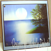
Brayered Bashful Blue ink at the bottom of the 4″ x 5.5″ piece of Whisper White card stock.

Brayered Creamy Caramel ink at the top of the card stock, at a bit of an angle.

Stamped the Leaves from the Stampin’ Up set Lexicon of Leaves at the top of the card stock with Always Artichoke ink.

Colored in the leaves with a Stampin’ Up Creamy Caramel marker.

Added a bit of Stampin’ Up Always Artichoke marker to some of the leaf tips.

Stamped the Flower Silhouettes from the Stampin’ Up Pocket Silhouettes set with Creamy Caramel ink and then over stamped them with Close to Cocoa ink.

Used the edge of a Brushed Corduroy Distress ink pad to add a bit of grasses over the flower silhouettes.


Outlined a few of the flowers on the right side with a Close to Cocoa marker to create a shadow on them.

My piece seems a little flat so I brayered Not Quite Navy ink at the very bottom of the card stock to create a bit more depth.

Also Brayered Close to Cocoa ink at the top right Corner, at an Angle to create more depth in the sky.

Sponged Basic Brown ink all around the outside edge of the card stock.

Adhered my main image panel to a Chocolate Chip panel, then adhered that to a Bashful Blue Panel. Smeared Brushed Corduroy ink at the top right hand corner of the panels.

Smeared Faded Jeans Distress ink at the bottom left corner.

Added another Chocolate Chip panel underneath. Added some Bashful Blue brads and assembled card.
Here it is finished measuring 5″ x 6.5″.
I hope your day is filled with peaceful scenes.
Until my next post. . . . . . . . . . . . . . .
Hugs,
Michelle
Get ready for Brayer Workshops! I am coming to:
Dayton, Ohio
Buffalo, Minnesota
Webster, New York
New Johnsonville, Tennessee
Stoughton, Wisconsin
Columbia, Missouri
Lynchburg, Virginia
Greewood, Indiana
Castro Valley, California
Yardley, Pennsylvania (near Philadelphia)
Knox, Maine
Broomfield, Colorado
Moore, Oklahoma
Portland, Michigan
2010
Jacksonville, Florida
Pocatello, Idaho
Salem, Oregon
Here is a link to my workshop calendar where you can see all of my travel schedule and to get info on beginner and advanced Brayer workshops: https://zindorf.splitcoaststampers.com/workshop-calendar
Link to my Stampin’ Up website were you can order all of your must have Stampin’ Up products from me 24-7: https://michellezindorf.stampinup.net
Here is a link to all of my tutorials: https://zindorf.splitcoaststampers.com/tutorials-ive-written/
Frequently asked questions answers: https://zindorf.splitcoaststampers.com/frequently-asked-questions/
16 responses to “At the Pond – Tutorial #212”