Aug 25 2009
Direct to Paper Branched Out - Tutorial #252
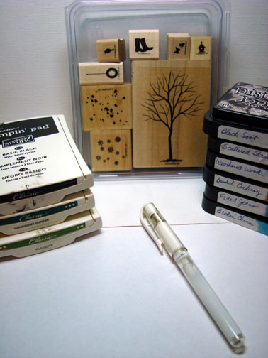
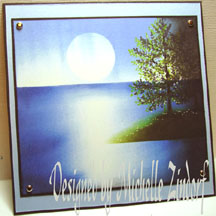
I love Tim Holtz Distress Inks and can spend hours whiling away smearing ink on card stock and creating backgrounds for silhouette images. Here is one I put together this morning. I hope this tutorial inspires you to smear some ink today.
Supplies:
| Stamps: Stampin’ Up Branched Out |
| Paper: Stampin’ Up Whisper White, Basic Black and So Saffron |
| Ink: Stampin’ Up Basic Black, Handsome Hunter, Old Olive and Tim Holtz Distress inks Black Soot, Scattered Straw, Weathered Wood, Brushed Corduroy, Faded Jeans and Broken China |
| Accessories: White gel pen |
Are you inspired by this Blog? One way you can help support this blog is by ordering your Stampin’ Up products through me. You can order from me 24-7 from this link: http://michellezindorf.stampinup.net or e-mail me at mzindorf@aim.com If you are within the United States. Want a copy of the brand new 2009-2010 Stampin’ Up Catalog for $9.95, just e-mail me at mzindorf@aim.com and I will get one in the mail to you. Want to become a Stampin’ Up Demonstrator and earn instant income? Consider being part of my Stampin’ Up Team. Through August 31 you can become a Stampin’ Up Demonstrator for as little as $85 with the mini kit. Also check out the Stampin’ Up specials, click this link to check it out: http://www.stampinup.net/esuite/home/michellezindorf/promotions
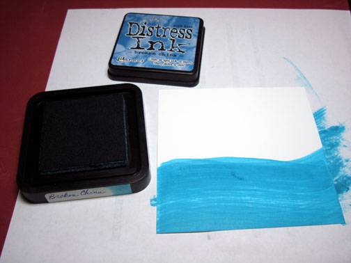
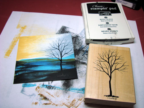
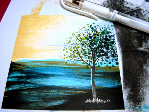
Started with a 4″ square piece of Whisper White card stock. Used the edge of the Broken China Distress ink pad and smeared it across the card stock. This technique is called “Direct to Paper”.
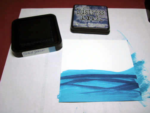
Added Faded Jeans Distress ink with the corner of the pad.
Added a little bit of Brushed Corduroy using the corner of the pad.
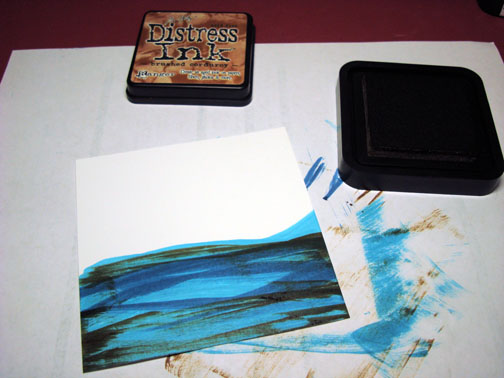
Added Black Soot Distress ink using the edge of the pad and a light touch.
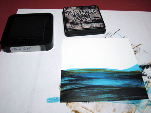
Added Weathered Wood Distress ink using the edge of the pad in the sky area of the card stock.
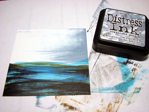
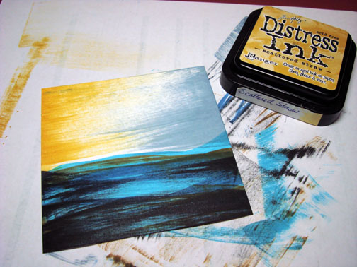
Added Scattered Straw Distress ink using the edge of the pad in the sky area of the card stock.
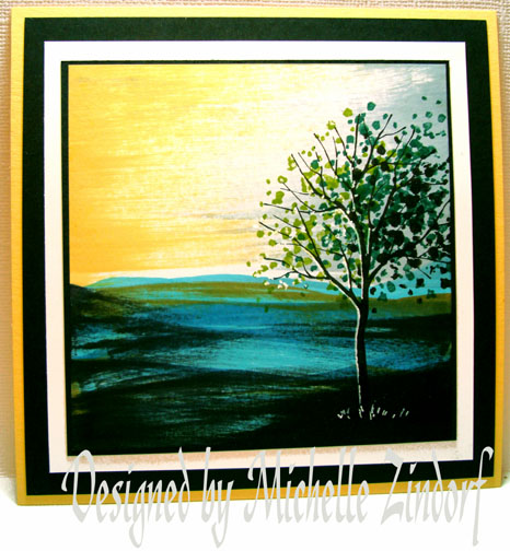
Stamped the Tree from the Stampin’ Up Branched Out Set with Basic Black ink.
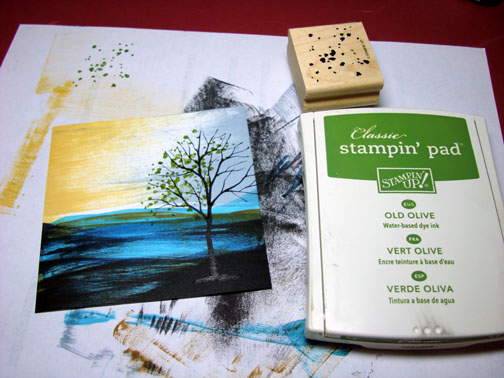
Stamped the leaf stamp from the Branched Out set with Old Olive ink on the left side of the tree.
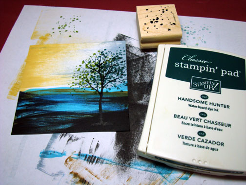
Added some more leaves with Handsome Hunter ink in the middle of the tree.
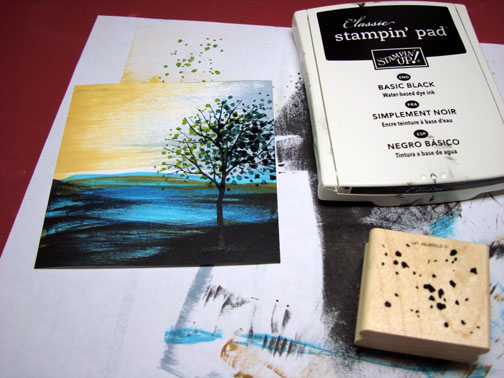
Stamped some more leaves with Basic Black ink on the right side of the tree.
Put some highlights in the leaves on the left side of the tree, out lined the left side of the trunk and added a few grasses at the base of the tree with a white gel pen.
Teamed the main image panel up with a few card stock panels and left off embellishments. Some times embellishments take from your design instead of adding to. I felt that was the case with this piece today.
This is the finished card measuring 5.25″ square.
Until my next post. . . . . . . . . . . . . . . . . . ..
Huge Hugs,
Michelle
Get ready for Brayer Workshops! I am coming to:
Greenwood, Indiana
Castro Valley, California
Yardley, Pennsylvania (near Philadelphia)
Knox, MaineAkron, Ohio
Broomfield, Colorado
Moore, Oklahoma
Nashville, Indiana Portland, Michigan
2010
Dayton, Ohio at Marco Paper
Phoenix, Arizona
Monroe, Louisiana
Jacksonville, Florida
St. Louis, Missouri
Mechanicsville, Virginia
Raleigh, North Carolina
Colleyville, Texas
Colorado Springs, Colorado
Boise area of Meridian, Idaho
Riverside, California (Southern California)
Salem, Oregon
Wheaton, Illinois
St. Cloud, Minnesota
Rockville, Maryland
North Chili, New York (near Rochester)
New Johnsonville, Tennessee
Helena, Montana
Middleburg Heights, Ohio
Venice, Florida
Here is a link to my workshop calendar where you can see all of my travel schedule and to get info on beginner and advanced Brayer workshops: http://zindorf.blogs.splitcoaststampers.com/workshop-calendar
Link to my Stampin’ Up website were you can order all of your must have Stampin’ Up products from me 24-7: http://michellezindorf.stampinup.net
Frequently asked questions answers: http://zindorf.blogs.splitcoaststampers.com/frequently-asked-questions/
Boy I am sooo going to try this one!!! I do have a comfort with Tim Holtz inks too. They just respond perfectly to the touch. Thanks for posting this one Michelle! I’m off to the studio!
oh wow - that is a really cool affect. Thanks for sharing.
I notice all the dates you have worked out for well into 2010 .. but none of them are in Australia .. I wish we could do something about that! lol
Oh WOW, I can feel the warmth of the rising sun! This is a stunning card. I have no
Tim Holtz ink but will give it a try with my S.U. inks. TFS an other great tutorial. hugs..
LOVE IT!!!!!!!!!! Have a great day!
OH MY GOODNESS! Such an awesome card. Love the Direct to paper method. I’ll be giving this a shot SOON. Thanks for sharing your talents - once again.
Beautiful. Can you recreate this look with other stamp pads, like Stampin up, or does it have to be the distress inks?
thanks.
OMG Michelle, the colors here are so gorgeous! I have a feeling this is another technique that you have to have the right amount of pressure to get the look that you have. Practice, practice, practice for me! Have a great day!
Nancy, you should be able to do the direct to paper technique with any ink pad that has a raised pad. In other words the pad needs to stick up past the base of the pad.
Clear as mud?
Great effect you have on this scene.
It is so fascinating to see how you develop a scene from a few swishes of ink pads. It appears as a serendipitous effect and yet your outcome is planned in some respect and the final scene is fabulous!!! I hope to give this technique a try but I’ll also have to learn to look at it with new eyes since it wasn’t until you swished the Weathered Wood that I could begin to see the beginnings of something wonderful. Before that, I saw just saw streaks. Thanks for this new lesson!!
off to my studio to try this…I have to take your class
This is just so stunning, great use of color and so dramatic.
Wow, this is such a stunning card. Very dramatic and beautiful. Thank you for showing us!
Awesome! I’ll have to try out a few of my distressing inks…
Thanks for the tutorial!
This card is so beatiful, and you are the greatest artist i have ever known!
XOXO Rosa from Germany
Just posted my version on my blog. I had fun trying this, don’t have the same inks but came pretty close. Thanks for the tutorial.
http://karensinspirations.blogspot.com/
Gorgeous, gorgeous, gorgeous! I love the colors you put together here….the sky is magnificent!
Michelle - this is wonderful!
Thanks for sharing!
Sandra
You make it look so easy.
Beautiful.
Michelle, I subscribe to your tutorials via email, but for the last couple of days I haven’t been getting them! Nothing worse than to turn on the computer and you aren’t there! Yet when I checked it still says that I’m subscribed. Any ideas? Anyone else having this problem? By the way love today’s card! Even if I did have to go hunt it down.
I’ve run out of adjectives to describe your STUNNING work and just when I think I’ve found a favorite, you come up with another one! Simply amazing.
Question: How do you store your Distressed Inks: face up or down?
Cheers
Awesome card. I’d love to see one of your creations “up close and personal” someday. In the mean time I’m sure enjoying them via the computer screen. Love this scene, it seems to have a real depth to it that is just amazing.
Michelle,
You can smear ink and make it look great. I smear ink and, well, it looks smeared!
Thanks for sharing your talent, another beautiful creation.
Niki
Christine, I store my distress ink face up.
wow - your work is so inspiring. I can’t wait to meet you in Yardley and take the class!
You never cease to amaze me with what yo can do with ink, paper and some stamps! This is so amazing! Off to play with some distress inks, see if I can get something close.
TFTI!
Wow! A masterpiece. Thanks for the inspiration.
Ooooh fabulous! Although I love all your cards Michelle, my favourites are the ones where you use trees and landscapes. I must have a try at this idea!
Oh, Michelle, won’t you come to Europe some day to teach us up here? Please do come to Holland too! I really love this one, but I am sad that I cannot see the ’smearing’ as you call it. Would it be possible to show us in a video how to do that? Anyhow, I am thrilled by your tutorials, have tried to copy some of them, but still have looooots to learn!
Bye, lucy
Michelle, this card is absolutely stunning. It looks like a painting. I have been away this week and have not checked your blog for a week almost and come to see this lovely card! Thanks for sharing.
FABULOUS!!! I love distress inks as well. What a great tutorial. You make it look so simple
I’ll have to see what mine turns out like!
Thanks for sharing your awesome work…love it!!!
I have never liked the distress inks… until now!
Guess I just never saw them put to such great use. Wonderful job Michelle.
Thanks, too, for the Stampin’ Up Holiday mini catalog!
i love when you do this with trees.
johanna
Beautiful! Love the Branching Out set and what you’ve done with it. What happened to Tutorial #250? My browser shows #249 and then #251. I don’t want to miss out on any of those beautiful cards.
Thanks again!
[…] Direct to Paper Branched Out - Tutorial #252 […]
Oh, Michelle- what a lovely tutorial! With my favourite inks too. You made me pull out my inks just to try this-I have to say though, your stokes with the inks look waaay better then mine.I guess a little more practice is needed as my streaks look like a 4 year old’s paint job. Methinks more practice is needed to achieve a satisfactory scene. Thanks so much for sharing this, though!!
Amazing!!!!